I always felt the negative version of these titles looked so much better.
I’d never seen it before so I had to have a Google
That looks pretty cool too
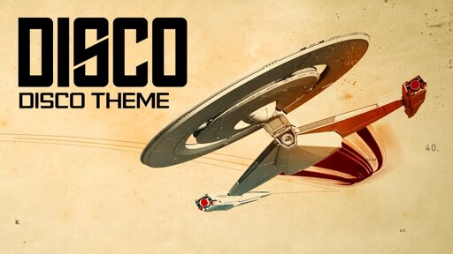
I thought this was going to be a video essay on Star Trek Phase II but I was pleasantly surprised

To be fair, the design of Discovery is very close to the Phase 2 concept art

Big fan of that design but even more of Disco (Season 1 that is)
Wow. You’re not joking even a little bit. I hated Discovery’s design when the first teaser came out, but she’s my favorite right after the Intrepid class now.
I’m still in the hate camp. To me, it looks like a Star Trek ship design made by a primary school student on a cafeteria napkin.
That’s what’s good about it, the beauty of the OG Enterprise was that any kid could draw it. It’s just three cylinders and saucer.